Introducing the New Payments2Us Donation Form
At Payments2Us, our goal has always been to provide nonprofit organisations with an effective, intuitive fundraising solution to help nonprofits increase donations, increase lifetime value, and drive sustainable fundraising growth.
For more than 15 years, we have been quietly obsessed with making fundraising easier. Easier for donors to give. Easier for teams to manage. Easier to understand what is actually working.
That has meant simplifying payments, cutting down admin, and making sure Salesforce data just shows up where it should. No duct tape. No spreadsheets. No late-night reconciliations.
Last year, we took that further with the launch of Payments2Us Studio, introducing cleaner, more intuitive donation forms built around how donors give today.
Building on that foundation, we’ve continued testing, refining, and learning from real donor behaviour, digging into conversion research and exploring how small design decisions affect real outcomes.
All of that work, along with direct feedback from nonprofits, has shaped the next generation of the Payments2Us Studio donation form.
Let’s walk through what’s new.
Clear and simple, by design
When it comes to donation forms, more does not always mean better. In fact, the data shows the opposite.
Fundraising research consistently tells us that around 1 in 4 donors abandon a donation form once they start. Every extra decision, every unnecessary field, and every moment of uncertainty increases the chance they will leave.
That is why the next generation of the Payments2Us donation form is built around one principle. Keep it clear. Keep it simple.
We focused on the parts of the form that have the biggest influence on donor behaviour:
How quickly a donor understands what to do
How many decisions they need to make
How confident they feel moving forward
Each change was made to remove hesitation and reduce friction.
Designed to work without perfect content
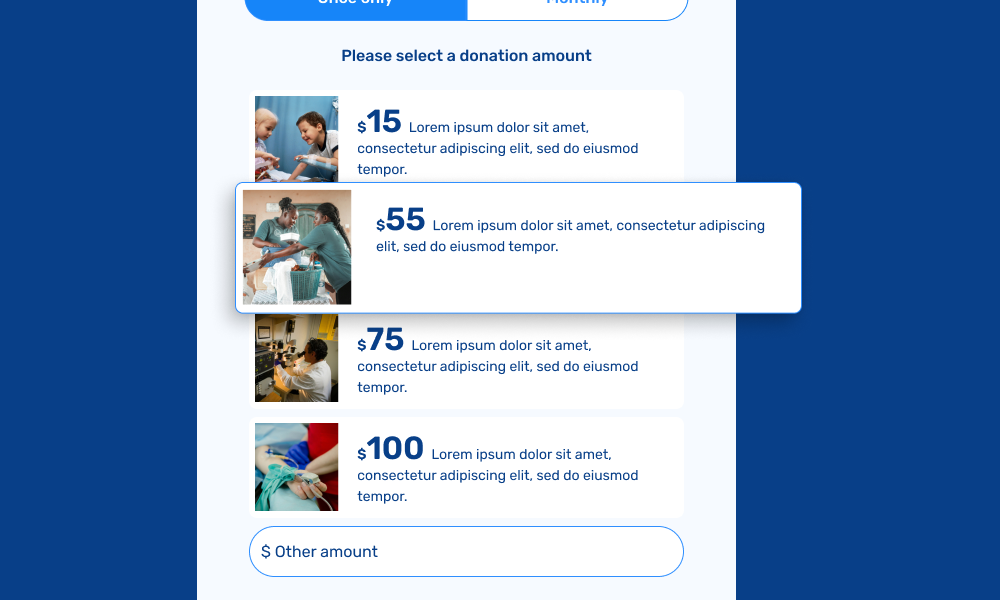
Not every campaign launches with a finished image or carefully written description. Waiting for perfect content can slow fundraising momentum.
The new donation form is designed to feel complete and trustworthy on its own. It does not rely on heavy visuals or long explanations to guide donors.
This allows nonprofits to:
Launch faster
Respond quickly to urgent appeals
Reduce dependency on design resources
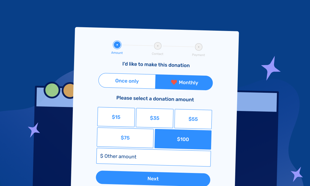
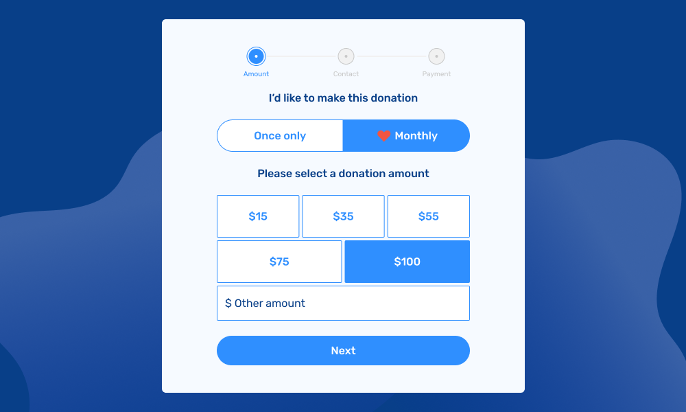
Regular giving made obvious, not overwhelming
Regular giving is essential for sustainable fundraising, with regular donors typically worth 2 to 3 times more over their lifetime.
Rather than hiding monthly giving or forcing it through pop-ups, the form introduces it clearly and early. Donors can easily choose between once-only and monthly giving, without feeling pressured.
This subtle shift encourages long-term support while respecting donor choice.
Create Your Next Campaign With Payments2Us Studio
Wrapping up
The next generation of the Payments2Us Studio donation form is not about adding more features or visual flair. It is about making deliberate, considered improvements where they matter most.
Every change has been shaped by real donor behaviour and direct feedback from nonprofit teams. The result is a donation form that feels easier for donors to complete and easier for nonprofits to launch, manage, and optimise over time.
This is what clear and simple looks like in practice. A form that helps more donors get to yes, supports regular giving naturally, and allows nonprofits to focus less on admin and more on impact.
If you would like to see how the new donation form works in practice, explore Payments2Us Studio and see how small, thoughtful design changes can support sustainable fundraising growth.